Adding to your Visualization
There are various types of elements you can add to your visualization to present your data. These include widgets, charts, gauges, tables, text, image and video embeds, and filters.
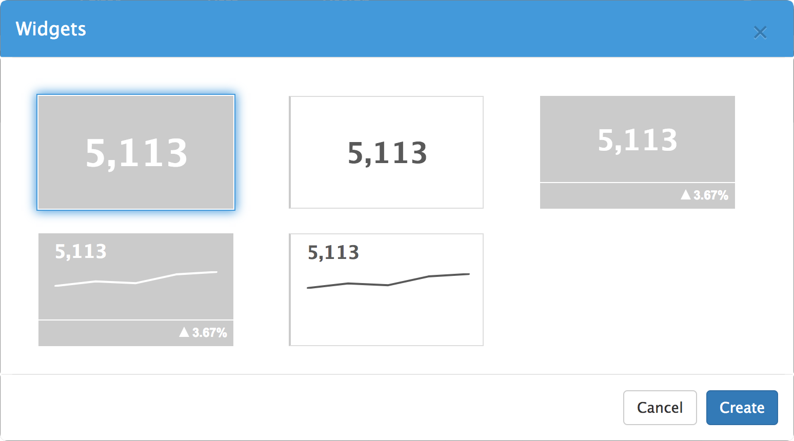
Widgets
Widgets highlight a single value, but can also show a simple trend line or a percentage change from the previous period.
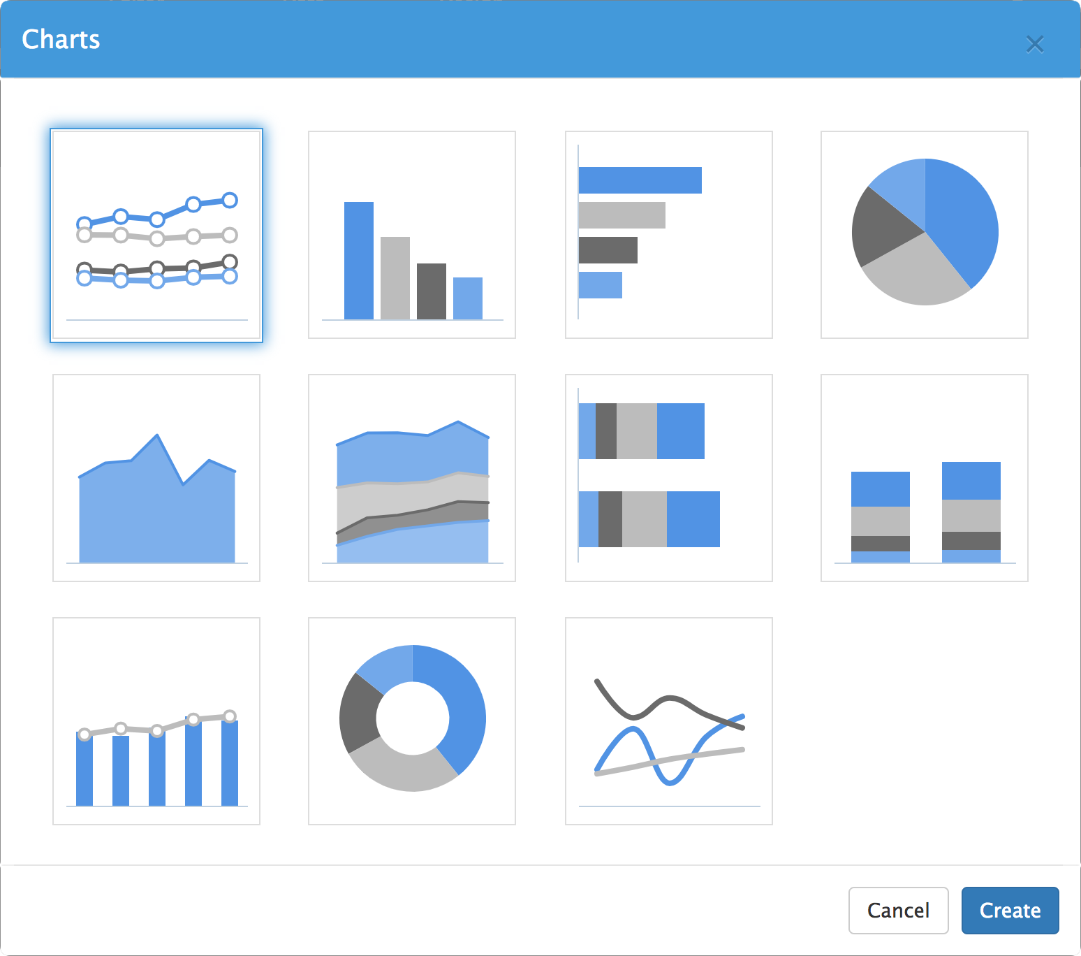
Charts
There are various types of charts you can use to present your data visually, including line charts, bar and column charts, pie and donut charts, area and spline charts.
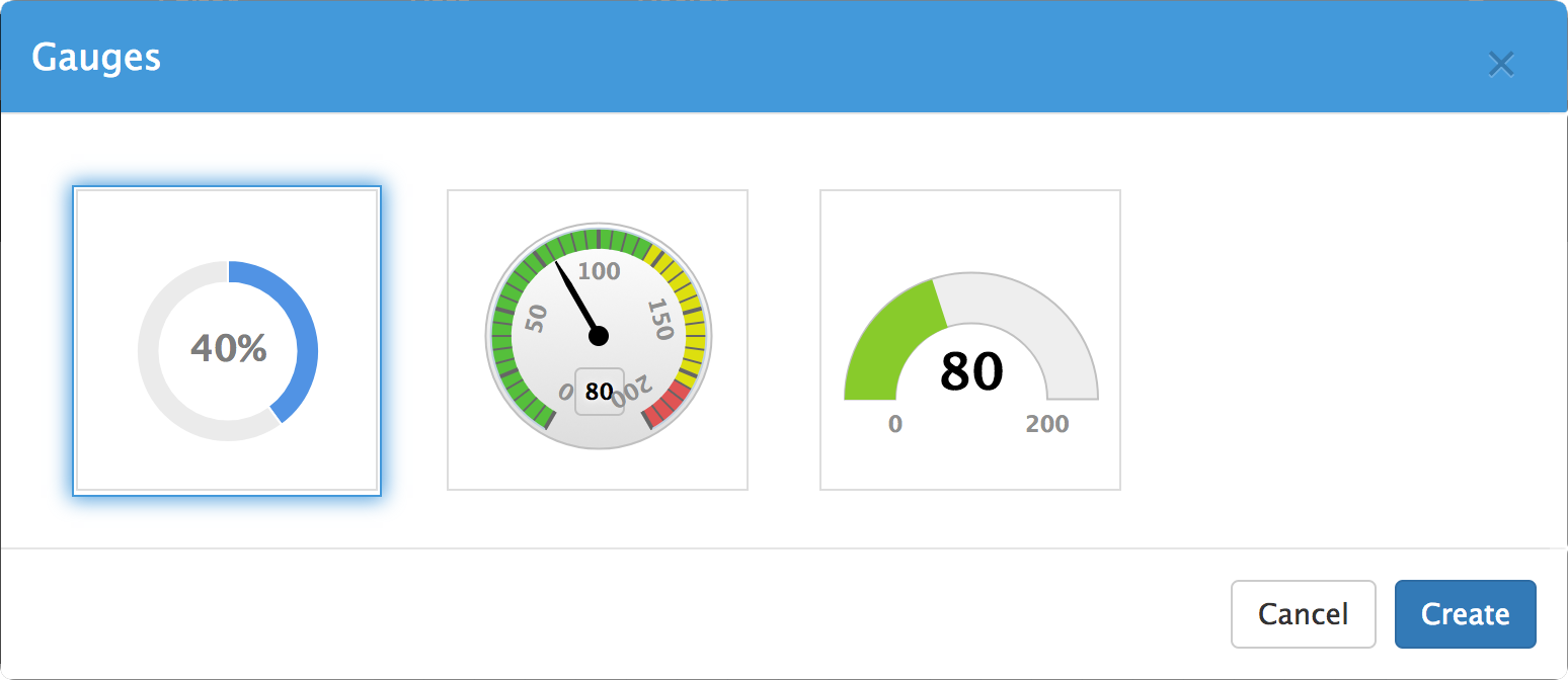
Gauges
Gauges show your data compared to a target or maximum value.
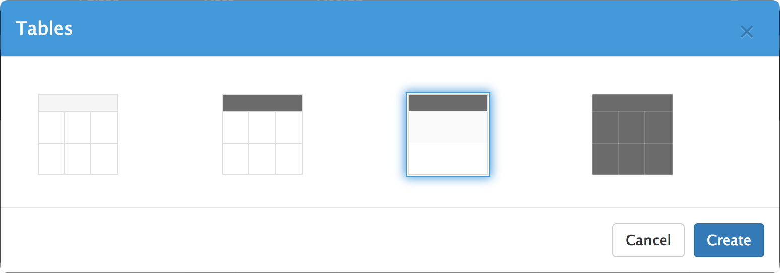
Tables
Tables can be used to elegantly format and display raw data.
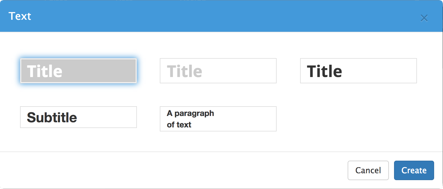
Text
Titles, subtitles and paragraphs of text can be added.
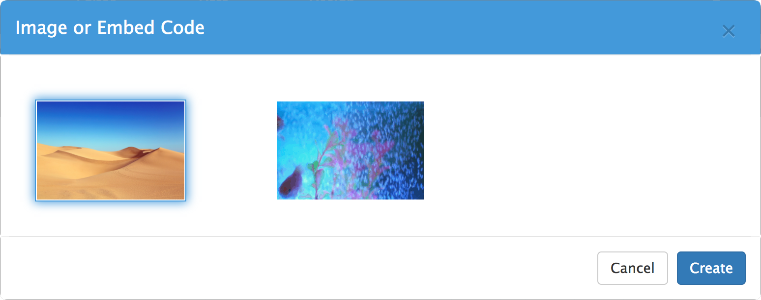
Embeds
Images can be uploaded and html embed codes, such as youtube videos can be inserted directly into your visualization.
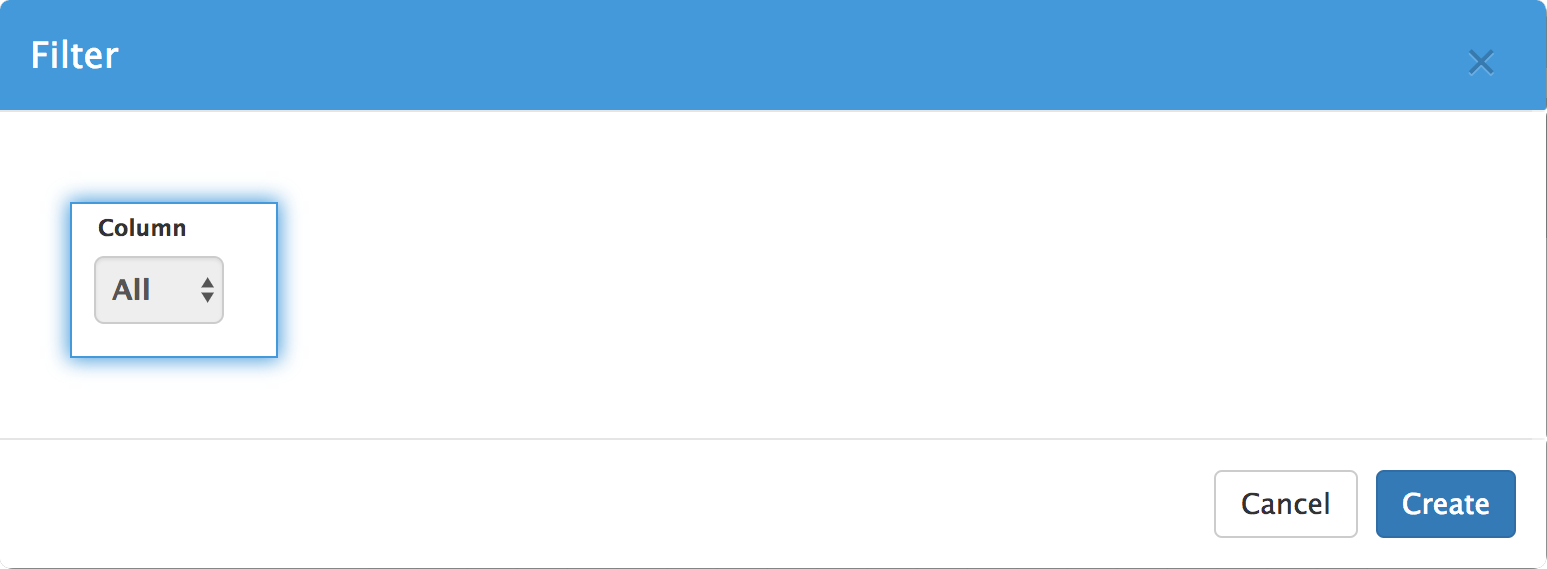
Filters
Filters can be used to dynamically choose a subset of your data for visualization, like a single product line or a single quarter of sales.
 Try Visual.is for Free!