The Principles of Visual Design for Dashboards
By definition, dashboards are visual displays which provide effective visualizations that help stakeholders take important decisions that help their organizations. With so much emphasis on design, you may be compromising this tool’s functionality and missing out on many opportunities. Whether you’re planning to create a custom dashboard or improve your existing system with an attractive dashboard template, the following lines are for you.
The Importance of Designing Your Dashboard
Contrary to what you’ve probably heard, design is actually one of the cornerstones of creating dashboards. For starters, it makes your business dashboard capable of drawing users in and engaging them. As a result, good visual design drives adoption, which is one of the biggest issues facing the business intelligence industry. Moreover, it increases the number of views and average value per view, two factors that determine the total value of a dashboard.
Visual design is equally important for quicker comprehension. If your users are turned off and not interested in using the system, chances are that they won’t be able to process the information it provides. This defeats the purpose of this system, which means that you’ve wasted time, money and effort for nothing.
Conventional Dashboard Design Principles
Principles of design are considered the building blocks since they determine how the elements of design (e.g. shape, direction and color) will be used. As a result, they can ensure the success of your overall design.
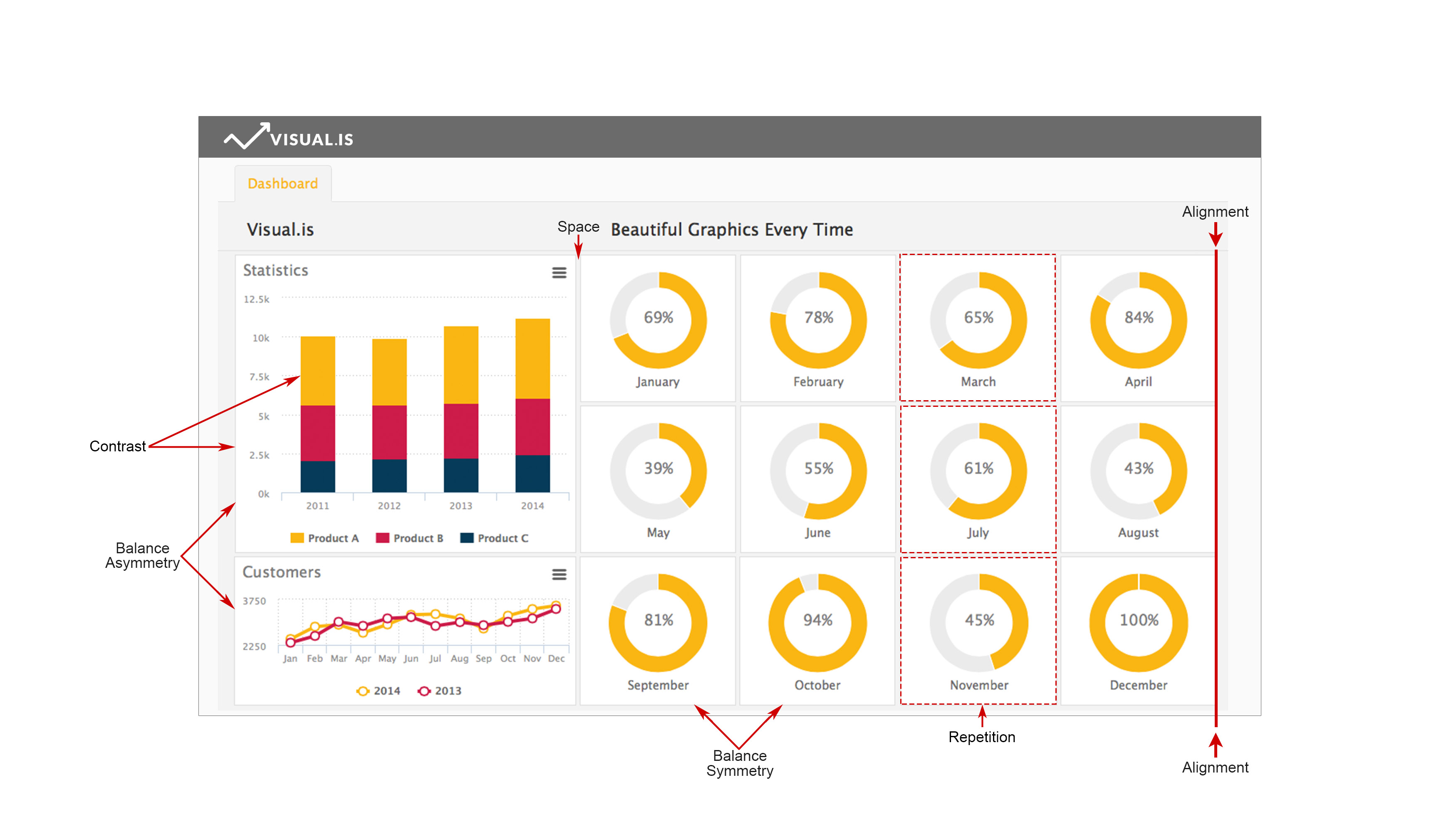
1. Alignment – A basic yet important principle, alignment ensures a sharper, more ordered design. It also creates a visual connection between visual elements, tightens the design, and eliminates the mess caused by randomly placing elements.
2. Balance – This principle is necessary for stability and structure in design. Basically, it’s the weight distributed in the design by placing elements of same or different sizes. It’s further divided into symmetrical balance (weight of elements on both halves is even) and asymmetrical balance (achieved through contrast).
3. Contrast – Contrast, which combines two opposite elements like colors, fonts or lines, helps designers emphasize key elements within the design. You can use this principle in your business dashboard to direct readers as to where to look or which element to interact with first.
4. Proximity – Necessary for creating organization, proximity allows similar items to be grouped close together to create a relationship between them. This means connecting images visually somehow rather than just placing them together.
5. Repetition – This principle creates association and consistency, strengthening a design and tying individual elements.
6. Space – Defined as the distance surrounding or within elements, space is vital for effective design, regardless of whether positive or negative. In fact, it reduces noise and increases readability, making it vital for your layout strategy.
The Gestalt Principles
The Gestalt principles are most useful, especially since they focus on creating a unified whole. They help users perceive the overall design rather than individual elements, ensuring the clarity of the overall design. The following six are common, basic Gestalt principles:
1. Closure – A popular design technique, closure uses the human eye’s ability to see closed shapes even if an object is incomplete or if its interior space isn’t fully closed.
2. Continuation – This principle helps in drawing users’ eyes along a path, line or curve to create the illusion of a single continuous figure rather than separate lines.
3. Figure/Ground – Using the idea of light and shade, this principle relies on your eyes’ tendency to view and separate objects from their surrounding background.
4. Proximity – The close arrangement of elements helps in creating a group association between them. This principle can be achieved using different visual elements.
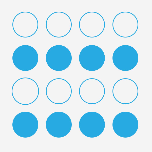
5. Similarity – Similarity allows users to believe individual elements to be part of a pattern or group, creating a single illustration from a series of elements.
6. Symmetry – The principle advocates the need to provide a sense of order and balance to save viewers’ time and ensure that they locate all elements and fix problems.
You’re welcome to blend both sets of visual design principles if you’re interested in creating appealing dashboard.